This Cozy Farmhouse Masters Modern Country Style

Alison Garwood-Jones

House & Home October 2018

HnH OCT 2018.jpg

Designed by Toronto architect John O’Connor of Basis Design Build, the two-storey retreat’s quiet ornamentation and dignified symmetry have a curious effect: although the primary reference is traditional, the home is decidedly contemporary.

ARCHITOURIST: HOW A DESIGNER IN TORONTO'S CABBAGETOWN RENOVATES FOR HIMSELF

Dave LeBlanc

GLOBE AND MAIL - FEBRUARY 20, 2019

IMG_9341.JPG

Setting up a condo sales office is one thing; the target market has already been determined, and the appropriate design follows. The office for a design-build firm is a bird of a different feather, however; one has to show their prowess, but not come on too strong since, after all, one never knows who might walk through the door.

“The theme I had was ‘Cuban infirmary, 1947,’” says architect John O’Connor, followed by a huge laugh that fills the front room of Cabbagetown’s 203 Carlton St.

He’s only half joking.

After an exhaustive search for an HQ for his 20-year-old business, Basis Design Build — “I was looking for a warehouse in the back alleyway kind of thing, I wanted to walk to work” — the Cabbagetown resident noticed an old Victorian home for sale near Ontario St. two years ago. Not only was it a good deal, he liked the heritage-protected building’s quirkiness: the too-fat, two-storey bay window, accompanying shutters and, inside, the stacked octagon-shaped rooms, original moulding and stairway niche.

“I thought, instead of a warehouse, it’s got a lot more personality,” says the Waterloo graduate who once worked for Vancouver legend Arthur Erickson.

Because it had been occupied by a graphic designer for decades, the former home of lawyer William Foss — he built and occupied the home in 1883 — wasn’t a mess. But it did require a somewhat anonymous identity so potential clients could envision their own spaces rather than Mr. O’Connor’s, which is where the infirmary idea came in.

Infirmaries, by their nature, must be clean and neutral; too many jazzy colours or jarring, ornate décor and healing is no longer the focus. So, in the public rooms of Basis, one’s eye has trouble falling on any one particular object, since all are white: white-painted metal pendant lighting, white chairs, a white fireplace surround … you get the idea.

But look closer and the unusual begins to appear: a vintage stenographer’s table, painted white; vaguely medical-looking IKEA cabinetry; exposed conduits; and old lath pressing against white plaster walls provides texture. And because Mr. O’Connor can’t help himself, bits of his fun-loving personality rear their silly heads in the form of a hard-hatted Elvis bust dominating the stairway niche (where a religious figure once stood), and the “cardboard safari” of a mounted deer buck over the fireplace.

 The overall effect is a comfortable, welcoming space where the overtaxed mind relaxes to allow ideas to blossom. In a way, a visit to Mr. O’Connors’ office isn’t all that different than checking into the Cuban infirmary’s close cousin, the Soviet sanatoriums of the 1930s-80s. A strange hybrid of medical facility and spa, visits to these soothing spaces were mandated (and paid for) by the Kremlin, and were filled with sunlight, non-porous tile, oil- and mud-baths and therapeutic swimming pools.

Okay, that might be stretching it.

But, if therapeutic bocce ball is your thing, Mr. O’Connor has a court in his backyard and, if you ask nicely, he’ll take you past hard-hatted-Elvis to the upstairs work area, where a refreshing display of creativity is on display. Past the big plotter (which sits in an odd, Munchkin-sized greenhouse area where windows reach the knees), a long room with a sloped ceiling contains a controlled frenzy of architectural activity. Here, pinned-up sketches on onion-skin paper compete with framed photographs of snazzy finished work, laptops sit on IKEA-hacked desks that look more expensive than they should, product samples hold down architectural drawings, Umbra stools made of twisted rope provide texture and, overhead, Mr. O’Connor’s hand-built 1990s chandeliers, made from cheapo colanders, ginger graters and other shiny bits-and-bobs, illuminate the scene while adding a touch of whimsy.

“We made this space to be creative in and not worry about writing on the walls or hanging stuff up,” he confirms. That loosey-goosey aesthetic is allowed in other second floor rooms, too: In a little boardroom not far away, sketches are pinned directly onto the large, drum-shaped lampshades.

 Regimentation, if there is any, is found in the building’s white oak flooring. The less busy, whiter pieces, explains Mr. O’Connor, were saved for the public rooms: “This’ll sound like I’m completely insane, but we searched around for these floors … then we sorted all the wood so the front rooms would be better, and [the back rooms would contain] all the wavy, unmatched [stuff] in grey and black.

“No one knows that except for me now,” he laughs, then looks down at the floor. “It was important at the time.”

While bouncing from room to room, the conversation bounces between Mr. O’Connor’s short-lived career as a house-flipper (it lasted for one house), to European cities he’s studied and worked in (many), to doorknobs (most are white porcelain and ordered from Ohio) and, finally, to how he deals with financial stuff at Basis.

“We’ll start talking about money on the first day,” he begins. “I know way too many cases where people have worked with an architect for a year, and then they’ll go thru the Committee of Adjustment and they get the price from the contractor and it’s double or triple of what they want to spend; so you’ve not only wasted a year, you’ve wasted the dreams and aspirations and everything.”

That would be a shame, since, here in these white, uncluttered rooms, dreams of house and home flow from head to pen rather quickly.

A REAL WORK OF ART

Martha Uniacke Breen

THE NATIONAL POST - FEBRUARY 16, 2019

A striking Rosedale staircase by Basis Design Build. Lisa Petrole

A striking Rosedale staircase by Basis Design Build. Lisa Petrole

Elevating the staircase to a whole new level and letting it set the overall tone for first impressions

The staircase is one of the essential features of a house — at least, any house with more than one level. But it has the potential to be much more than just a structural element. Because it is physically and psychologically at the centre of things, it can provide a major design statement in a home.

From the most rudimentary ladders and earthen steps of ancient houses, staircases have always been, first, a way to provide access from one level to another, and the basic components are simple and universal: treads (the horizontal boards), risers (the vertical boards), stringers (the zigzaggy side pieces), and railings (which, in turn, consist of vertical pickets and horizontal handrails). If the course of the staircase is long, a landing provides a moment of rest before you continue; it also allows the stair to take up less lateral distance, since it can accommodate a change in direction. Stairs can run next to a wall, or rise through the centre of a shaft (or in the open). If space is really tight, a spiral staircase can wind upwards either inside a stairwell, or protect users with a railing.

Building codes have clear standards governing safety, structural soundness, and proportions, which have evolved over time. Despite all these restrictions, architects and designers frequently see the staircase as a real opportunity for creative expression, as the central structural component of a house. While certain dimensions are immutable — railings, treads, and the size of the rise, which has to match an average footstep — there’s room for variation in width, shape, placement, and of course, materials. And there’s also plenty of opportunity for design gestures, which can turn an ordinary household feature into art.

“A home is like a movie in a way, in that it unfolds in time. The stairs are part of the architectural ‘procession’ of the house,” observes Toronto architect John O’Connor, principal of Basis Design Build, which specializes in custom homes. “You can look at a staircase as a real work of art, since because it’s at the centre of things, it’s a great showcase. Depending on the client’s taste, you can use materials that appear in the rest of the house, like certain woods or metals, or use it as a setting for artwork.”

One recent example he points to is a stair in a Cabbagetown home, with custom-sized and specially lit art niches in the walls for the client’s sculpture collection. The staircase’s central location makes it a perfect way to bring light down through the interior of the house. O’Connor and his team almost always place a skylight in the roof directly above stairs and frequently, side windows bring in light and views that offer a unique perspective.

Even in planned-community homes, many developers offer a selection of choices, particularly for finishes and details: metal or wood pickets (often, in a selection of decor styles), different types of wood for treads and other elements; a choice of carpeting, stair runners or hardwood steps.

At The Winslow, a new Lawrence Park condominium project with 68 units, Devron Developments pays homage to the importance of stairs and everything is customizable.

“They are meant to be the first thing you see when you enter,” Pouyan Safapour, the chief operations officer, says of the staircases. “The details really make the first impression.”

And they serve an important esthetic and formal function, he says. The railing design at The Winslow mimics that of the Juliet balcony on the exterior of the home. And the space below the stairs, which is adjacent to the kitchen, has been carved out to provide extra pantry space.

The stairs themselves are designed to have a gentle rise and an elegant flow, Safapour says.

The visual impact of staircases can’t be under-estimated. Along with finishing materials that might match or create a sense of harmony with the rest of a home’s interior, it’s important to consider where the light falls in your house; privacy concerns (do you want it to conceal or overlook other levels?); your lifestyle — do you entertain frequently, in which case stairs may help organize or allow for larger volumes of space? Do you want the stairs to be a major design feature of your home, or to fade into the background? And what views — interior and exterior — do you want to highlight?

For a house on the lip of the Moore Park ravine, Basis Design Build’s O’Connor created a sequence of glass walls rising almost the full height of the staircase. This offers a leafy view, which in winter becomes a long-distance vista through bare branches. The accompanying staircase is similarly light and transparent, with streamlined railings of steel and perforated metal, open risers and reclaimed wood treads.

“I think of both artwork and views (both to the outside and interior), and the view in front of and behind you as you use the staircase. A window on the landing or by the stairs often gives you a special perspective on the landscape you can’t see from any other place — it’s like a secret.”

In fact, risers are not required by code, although the measurements and specs for open (riser-less) stairs are quite specific. Modern architects frequently choose this alternative as a simple and effective way to visually lighten the staircase and increase light transfer. However, it does mean taking care to make the staircase extra strong. “In many ways, making a staircase has a lot in common with making a fine piece of furniture, but it has a lot of requirements a dining table doesn’t!” O’Connor says laughing.

Stairs can be utilitarian, or a piece of art, says Christian Huggett, vice president – development, of Podium Developments, which is building four luxury detached homes on Glen Edyth Drive in Toronto’s South Forest Hill.

“Staircase design is an important part of any home,” Huggett says. “In an open concept it can create a threshold for movement to our private spaces, or be a moment of surprise in a separated series of spaces.”

For a house in Hogg’s Hollow, O’Connor did just that. He designed an artistic variation on the open-riser concept: individual boxes attached to the stringers, but not to each other, allow light to penetrate between steps, and the entire apparatus “floats” an inch or two free from the side walls (or, for part of the course, the steel and brass railings). The secret lies in the zigzagging stringers themselves, which are made of steel and are so sturdy the staircase never so much as trembles when walked on.

One of the most dramatic staircases in O’Connor’s portfolio is one in a Rosedale home that splendidly illustrates how it can be a central part of the action, not just a route from one place to another, however pleasant that may be.

Part of a whole-house renovation, the staircase winds elegantly throughout the centre of the house, with walls inset with concealed lighting and mirrors that visually expand the views. These steps also float free of the wall, reinforced by sturdy steel stringers; delicate bronze-capped pickets further lighten the look. Light cascades all the way from a large skylight high above the top floor to the basement, culminating in a wine cellar above an underlit onyx floor. “So anywhere on the stairs, you can look up and see the sky, or down and see the onyx floor, which looks like an ice skating rink.”

“A staircase is one of the ‘big’ elements of the house; it’s anchored to the house and makes the home work,” O’Connor says. “So esthetically, you can start with the expressive elements, with certain materials used in the rest of the house. But really, it goes far beyond décor.”

Source: https://nationalpost.com/life/homes/taking...

TRANSFORMING A 100-YEAR-OLD MANSE

H&H - FEBRUARY 2015

2011-1109 BASIS 28503.jpg

TRANSFORMING A 100-YEAR-OLD manse into a family-friendly hangout zone without stripping the grand dame of its historic elegance is a tall order. But with the help of Toronto architect John O’Connor of Basis Design Build and designer Kim Lambert, homeowners Ellen and Sam Webster have created a place that’s casual enough for their four kids to plop down anywhere, but sophisticated enough to please a grown-up crowd — just check out the living room’s backlit onyx bar. “We didn’t want a showpiece,” Ellen says. “We wanted the space to be open enough for all of us to gather together as a family, and we wanted to be able to entertain.” The fact that Ellen and Sam both grew up just blocks from the house made it seem like kismet when they spied the listing four years ago. By then, they had spent a year hunting for a home that could comfortably fit their growing teens and tween — Carter, 16, Max, 15, Amy, 13, and Catherine, 11 — who had their old digs bursting at the seams. “Every house seemed like a compromise. Either the kids had to share bedrooms, or there weren’t enough bathrooms. Then we walked into this house,” Ellen says. “We looked at each other, and that was it!” With its six bedrooms and six bathrooms, the stucco-and-stone Georgian had plenty of space and could be turned into their ideal home without a total gut job. The outside was so perfectly pretty it was barely altered, but the interior underwent a 10-month revitalization. The HVAC and electrical systems were all updated, and the panelling and mouldings were meticulously restored or replaced. When the reno finally wrapped, the once-traditional space had been transformed into a bright, contemporary family home — all with the utmost respect for its century-old bones. “The only wall that came down was the one that separated the kitchen and dining room,” says O’Connor. Removing it created a clear view from the front of the house out to the back garden and turned the old galley kitchen into a large eat-in space. The home’s formality was further dialled back by replacing the old hardwood flooring. Heated honed limestone now runs from the entry to the kitchen, where a large marble island gives the playful space an element of sophistication. Warm walnut planks, paint and furnishings then transformed the wood-panelled library into a cosy family room and the formal living room into a gleaming cocktail lounge. “We want everyone to feel at home here, from guests to the kids and their friends, who should feel comfortable on every sofa,” Ellen says. Now that the family has put the house through its paces, she’s happy to report that their mission was accomplished. “I wouldn’t change a thing.”

See the home tour on House & Home

GREAT SPACES: SEE INSIDE A MOORE PARK HOME THAT FEELS LIKE A FAMILY-SIZED TREE HOUSE

MATTHEW HAGUE
TORONTO LIFE MAGAZINE -
MARCH 2014

great-spaces-family-sized-tree-house-01.jpg

Mary Abbott grew up outside of Guelph in an old farmhouse so secluded that her parents didn’t bother with curtains. “The land around us was made up of fields and forests,” she says. “It was extremely private.” Abbott has since left the rural life behind. She’s a corporate lawyer, her husband, Kevin Gormely, is an executive at a printing company, and they live in the middle of the city with their two small boys. Still, she channeled her upbringing when they rebuilt their home last year. The property is ensconced in the tree canopy of the Moore Park ravine, so she opted for giant picture windows with no coverings. Even the master bedroom is ­drapery-free—Abbott and Gormely enjoy waking up with the sun. The couple, working with architect John O’Connor of Basis Design Build, also kept the ­interiors spare to better showcase their extensive collection of contemporary Canadian art. Spare, but not spartan: O’Connor incorporated natural materials like soapstone, birch and Douglas fir to add rustic warmth. So even though the house looks modern, the palette is as ­elemental as the towering trees outside.

THE VIEW

KELVIN BROWNE
INTERNATIONAL ARCHITECTURE & DESIGN
- SUMMER 2008

Basis-Design-Build_ISLAND-COTTAGE-2011-1.jpg

Architect John O’Connor talks to Kelvin Browne about THE VIEW

Kelvin Browne: You’re currently working on a large project on an island in Georgian Bay, Ontario. What are you learning from this experience?

John O’Connor: When you’re designing a house on a unique property, one with waterfront and spectacular views, for instance, it’s important that both the site planning and the design of the structures frame and edit what makes the property special. In other words, you don’t want to constantly focus on the “view” all the time. This single-minded approach diminishes the drama of a property – and likely the architecture, too.

KB: This is the problem with a house with gigantic picture windows and an obsession with views.

JO: Sites should have complexity. Making the most of a good view means seeing it in different ways and developing the landscape, so that it offers varied and interesting experiences. On an island, you should give opportunities to be away from the water, too – you can become indifferent to it because of constant exposure.

KB: People often feel a waterfront location does it all and their house isn’t important, other than those big windows, of course.


JO:
 Many houses on special properties are being built as retreats. They should feel different [from] a house in the city. [The house] should feel different [from] everyday life. [It] should enhance the quality of life on the site, not merely exploit its views. It’s wonderful to have a remarkable property to start with , but that doesn’t mean a house still doesn’t have to be a good place to be, just as if it were a house with conventional relationships to street and garden, or front and back.

Kelvin Brown is editor-at-large at INTERNATIONAL ARCHITECTURE & DESIGN

TWO VIEWS OF A GREAT ROOM:
A former bungalow, this Toronto ravine house was given a rustic great room that brings light in and opens up the space to the view of the valley.

A third-floor live/work space with a south exposure and an indoor-outdoor look pulls its inhabitants out to a rooftop deck at the end of the workday. A sandblasted glass shower placed at the bottom of the stairs adds an unexpected twist.

JOHN O’CONNOR received his environmental-studies and architecture degrees from the University of Waterloo. Studying extensively in Europe led to numerous work experiences for him in London in the late eighties and in Venice in the early nineties. The foundation of his Canadian experience was his work with famed architect Arthur Erickson. O’Connor is the principal of Toronto based architectural firm Basis Design Build Corporation.

IN ROSEDALE, MAKING AN EFFORT TO FIT IN

CAROLYN LEITCH
GLOBE AND MAIL
- MAY 9,2008

Basis-Design-Build-2.jpg

Iain Morris and Fiona Macfarlane lamented the one-of-a-kind Vancouver home they left behind even as they celebrated the career moves that brought them to Toronto.

The couple had spent three years building a contemporary family home with a spectacular view over the water. But they had scarcely settled in when Ms. Macfarlane was lured to Toronto by an enticing position with an international accounting firm.

Mr. Morris, a partner with a rival business giant, also shifted to the east and the couple began looking for new real estate.

But even as they searched the established neighbourhoods of Forest Hill and Rosedale for properties, they were yearning for the modern simplicity of the house they had built on the West Coast.

“That was fresh in our minds,” says Mr. Morris.

The couple had also experienced a predicament common among those who commission a custom-built house: the Vancouver property they had tailored to exactly suit their needs proved to be hard to sell.

So the duo approached their Toronto real estate search with a deliberate five-year plan and a down-to-earth exit strategy: they decided to look for an undervalued property in a sound neighbourhood. The budget for renovation would be strictly controlled so that they could recoup their investment — and possibly make a profit — if they decided to move on after a few years.
Real estate agent Kathryn Harris of Chestnut Park Real Estate Ltd. helped to fulfill the first part of their mandate. She found a grand old house on Binscarth Road that had been in the same family for 75 years.

Then the couple brought in architect John O’Connor of Basis Design Build Corp. to find out if they could turn a heritage-protected home on one of Toronto’s most prestigious streets into the type of modern dwelling that would accommodate a lively family with two children, three dogs and two cats.

“We were in a bit of a dilemma,” says Mr. Morris, “[wondering] how are we going to achieve what we wanted to do in Vancouver while respecting the heritage of Rosedale?”

The result is a house that sticks to rules governing Rosedale’s heritage protection on the outside, while appealing to the couple’s modern sensibilities on the inside.

“We wanted a house that we would enjoy living in, but not to be so edgy or so off-the-beaten-track that it would lose a broad sector of the market,” says Mr. Morris.

From the start, Mr. O’Connor could see the house on Binscarth had potential, but first he would have to undo decades’ of interior changes and additions that had created lots of small rooms and poorly placed staircases. Upstairs, for example, residents had to cut through a closet in one room to get to a bedroom beyond.

“It was a rabbit warren inside,” he says. “You literally used to get lost in here.”

Mr. O’Connor called for the house to be virtually gutted. The living room and dining rooms remain in their original position overlooking the street, but little else of the original plan remains.

The main floor has been designed to create open space and sightlines from one room to another. Sliding doors can be pulled across the doorway to provide privacy, but most of the time they are left fully open to disappear against the wall.

There are no coverings on the doors or windows to close the house in.

“We wanted to have as much natural light as possible,” says Mr. O’Connor.

The architect also kept the palette and materials simple and consistent. White walls, stone floors and deeply-stained walnut doors and trim are used in most rooms. People sitting in the living room, for example, can see the cabinets and woodwork in the family room, so Mr. O’Connor had them made of the same walnut.

Cabinets in the main hallway, family room and kitchen are sleek and uncluttered.

A wall in the living room had what Mr. O’Connor describes as a strange and off-centre fireplace. He reconfigured the wall so that it can accommodate a large and dramatic painting visible to diners sitting at the dining table.

Ms. Harris of Chestnut Park advised the couple on designing for resale.

She gave them suggestions on the features that would make their home appealing to potential buyers in a few years.

Lots of families consider a mud room important, for example, but Mr. Morris and Ms. Macfarlane thought that keeping the space open was a priority. Mr. O’Connor solved the problem by creating a rear entrance to the kitchen and lining it with walnut cabinets.

“Ideally, you’d have a mud room in a house this size but there’s just no way to do that without compromising the view,” says Mr. O’Connor.

At the centre of the house, he designed a shaft that holds a floating staircase of steel and glass. “We had to look for architectural opportunities,” says Mr. O’Connor of the design.

Upstairs, the second floor was entirely rebuilt to provide three bedrooms and three bathrooms. Bedrooms were given generous storage and, in one case, he split a small room into two closets.

“It’s important to have big, walk-in closets for resale,” the architect says. “The two of them together would have been a decent-sized bedroom.”

Similarly, each bedroom has an ensuite bath. Mr. O’Connor points out that a child’s bedroom with bath could easily be used as a home office that takes advantage of south-facing windows.

The master bathroom has a deep tub, walk-in shower, and a serene palette of walnut and Loire stone.
The third floor provides a guest suite and nanny’s quarters, but Mr. O’Connor says another family with older children could make the top floor a kids’ level. “It’s hard to anticipate how other people would use a house.”

Nevertheless, he tried to make the spaces as flexible as possible. The home’s seven bathrooms make it easy to create smaller suites for family members, guests and workers.

A large third-floor deck of wood and glass can’t be seen from the street, so Mr. O’Connor designed it to blend with the contemporary interior.

“It’s an indoor-outdoor space so you have to do something that will make it look modern and clean,” says the architect.

Mr. O’Connor added 45 centimetres of ceiling height in the basement by having the floor excavated. Using a concrete bench underpinning was an economical construction method. Throughout, the architect worked with Mr. Morris, Ms. Macfarlane and interior designer Connie Braemar to choose finishes that are not too trendy.

“I always think that these houses should look good in 10 or 15 years,” Mr. O’Connor says.

The infrastructure, meanwhile, should last decades: He had the lighting and electrical systems upgraded, and heated all of the stone floors.

“I always think if the house is designed right, it’s classic — it’s a liquid asset. You could sell it at any time.”

Mr. Morris says the result is a house that fits the family and is mindful of the resale value. He’s hard-pressed to think of any changes they would have made, no matter how long they planned to stay. “I’m not sure that we would do a whole lot differently.”

And while the family may stay for decades, the couple is happy to know they very likely have a solid investment if fortune takes them elsewhere any time soon.


GREAT ROOM

KELVIN BROWNE
THE NATIONAL POST
- MARCH 29,2008

Basis-Design-Build_FAMILY-HOUSE-2007-5.jpg

“We just bought the ugliest house in Rosedale,” its owner confessed to architect John O’Connor. Without missing a beat, my friend John replied, “Oh, you must mean the house at ?” Shock, then laughter all round. John had begun to design a renovation for the previous owners of the house and their real estate agent had referred John to the new owners.

Two years later, the transformation is formidable, but ugly was the wrong word to describe it then. Located in an established area of mostly traditional and considerably grander homes, this 1958 suburban-style bungalow was more out of place than unattractive. Still, being perceived as ugly was certainly a handicap. The house had self-esteem issues: Its plan was confused, its rooms poky, and a large, 1970 indoor-pool addition felt awkward.

Exacerbating the home’s problems were the expectations of the new owners. They wanted a family house where their three children would feel comfortable with friends. Comfortable for the kids means they have p-r-i-v-a-c-y. It’s smart parents who want their kids to hang out at home and not at the mall; it’s fortunate kids who have enough space so that it doesn’t seem like mom and dad are spying. (To say nothing of parents wanting privacy, too–not that kids would understand this.)

The owners knew that trying to turn a classic, if unloved, contemporary house into something Georgianesque would only create a mess. John says, “They understood the potential of keeping the modern aesthetic, simple and clean, both in terms of the style of house and how this approach could create the comfortable family home they wanted.”

Fortuitous for John, the owners are not pretentious and didn’t want the house to look flashy from the street. He wasn’t going to be asked to add a columned portico, for instance. Similarly, the owners appreciated John’s flair for subtle detail and didn’t demand the ridiculous affectation of elaborate cornice mouldings and gigantic door trim that would be contrary to the home’s DNA.

It’s useful when architect and client get along well, as John did with the owners of this house. While it sounds like silly, new age spirituality, every house has a vibe and you can tell when a client and architect have got along or not as soon as you walk in. The vibe is good here, too, because there isn’t a conflict between the architect, owners and the contractor. John’s firm is Basis Design Build. He’s the contractor as well as the designer. I joked that design/ build made it difficult for the architect to blame mistakes on the contractor. I think John laughed.

What was the reno strategy? First, John reorganized the spaces and oriented them by adding a new entry pavilion. This new room establishes a visual/circulation spine to which the living and dining rooms, the kitchen and great room, and, finally, the indoor pool, all connect. It’s like a centre hall plan, only the hall is invisible.

Second, John added a great room. “The house needed a large, noteworthy space, not only as the main entertaining area but to balance the smaller areas of the house and relate to the large pool area.” It’s also the part of the house that connects to the garden and brings the outside in. The new great room feels expansive but not out of place. Its careful detailing stops it from feeling too big. “The lowered ceilings on the south and west give a sense of a wrap-around porch and this makes an easy transition to the exterior,” explains John.

He also added space for the kids and a second floor. What’s remarkable is that the facade of the house barely hints at the second storey, with its new master bedroom, ensuite and office. The bungalow spirit has been retained, though the house is now much larger, having expanded from about 8,200 square feet (including a finished basement) to 11,600 sq. ft.

In any renovation, even if the transformation is stunning, it’s often equally amazing to learn what’s been done that you can’t see. Such is the case here. If you need a lesson in how home technology has progressed in 30 years, renovate. “It was a complicated renovation, from a technical perspective, with most everything needing to be redone,” says John. “An indoor pool adds another set of issues.” In this regard, my fear of homes with indoor pools — they reek of chemicals — is unwarranted. Precise balancing of air pressure keeps the poolside ambience out of the house where endless doors couldn’t before.

The owners certainly picked up on the contemporary sense of the house when they moved in; when they decorated, new modern furniture and bold contemporary art appeared. It all adds up to a welcoming house. It’s always enjoyable to visit a well-designed contemporary house, but it’s even better to see one where everyone feels at home.

RESTORATION DRAMA

KATHERINE ASHENBURG
TORONTO LIFE MAGAZINE
- MAY 2006

Basis-Design-Build_LIVE-WORK-HOUSE-2001-POST.jpg

John O’Connor’s reinterpretation of his 130-year-old Cabbagetown cottage may irk the preservation association, but spirit trumps historical accuracy

At first glance, Amelia Street is a typical stretch of Cabbagetown, lined with houses in late-Victorian styles, lovingly tended by their preservation-conscious owners. But Amelia, just south of Wellesley, has a specialty. It’s unusually rich in a lovable little house known as the worker’s cottage. One or one and a half storeys high, with a central peak over the front door, the style descends from a prize-winning design that was presented at London’s Crystal Palace Exhibition in 1851. Basic and cheap, the idea crossed the Atlantic, and thousands were built in poorer neighbourhoods across Ontario in the last third of the 19th century. For the same reason, relatively few of the houses have survived. In the first block west of Parliament Street, Amelia’s cottages come tricked out in all the winsome details that this style inspires. One house is clad in rustic stones, others in brick and stucco. Shutters, etched-glass transoms and bay windows animate the cottage’s simple shape. The peaks are edged in the undulating wooden gingerbread that spells “Home Sweet Home” to lovers of Victorian architecture.

And then there’s 50 Amelia Street, the home of Rick Hayward, an executive in a multinational corporation, and John O’Connor, an architect. The trademark profile, dominated by the sharp gable, is in place, prefaced by an informal perennial garden. But the house completely lacks gingerbread, finials or any other reassuring accessories, and is covered in something grey and industrial-looking. The plain-spoken facade is not unfinished, as many passersby assume, but covered in cement board punctuated by vertical metal strips-a witty take on traditional board and batten. The cladding, plus a staggered path of cement panels, a swanky stainless steel handrail and a meticulously detailed but utterly contemporary mailbox-cum-lamp, announces a sensibility bent on something more complicated than restoration. This is a new way of acknowledging Cabbagetown’s heritage that is neither slavish nor precious. This is an Ontario cottage that does not do cozy.

John O’Connor never intended to toy with historical accuracy when he bought the house in the late ’90s. A tall, likable man with a ready laugh, O’Connor was at a crossroads in his career. He’d just finished managing the creation of the Don Mills and Downsview subway stations, and wanted nothing more to do with big, frustrating jobs “where the design aspect gets killed.” At the same time, he’d gutted and renovated a house on Brunswick Avenue and sold it a year later for a profit of almost $200,000. He’d found the hands-on experience of designing and building a house the most satisfying work he’d done, so he decided to start a small company of his own.

Hoping to duplicate his financial success in the Annex, O’Connor looked fruitlessly for an empty lot on which to build something new. Then one Saturday afternoon, he saw an ad in the Toronto Star for a Cabbagetown house priced at $225,000. He was there within half an hour and found an 1870s cottage in “really rough shape,” with a La-Z-Boy in the yard. An elderly woman had lived there for almost 50 years. O’Connor had only two questions: does the house have termites, and is there access from the laneway? As soon as he got the right answers (no and yes), he bought it.

Over the next couple of months, he arrived at a few key decisions. “The cottage needed to be torn down,” he says, “but the neighbourhood needed the cottage.” Derelict as it was, the house was a relatively rare survivor of an endangered species, and part of what makes Amelia Street distinctive. Not every modernist designer has such sensitivity to a very modest piece of the past. O’Connor traces his to the three years he spent in Venice as a young architect in the early ’90s, where he learned that a city disrespects its historic fabric at its peril.

But an authentic restoration of his cottage was never an option. A place has to be able to grow and change, O’Connor says, and the additions, “no matter how aggressive,” should acknowledge the older partswhile being absolutely of their own time: “Sure, you can have a Victorian neighbourhood, but is it going to be Disneyland, untouched forever? People are driving flashy cars these days, not horses and buggies.” When I suggest that many people want their 19th century straight up when it comes to a district like Cabbagetown, he says, “But diversity and layers of history living together is what makes cities. Without that jumble, it’s just a shopping mall, with everything looking like it was built at the same time.”

O’Connor decided that he would live and work on the property. First, he would convert the 525-square-foot cottage into his studio and office. Then, in the ample backyard, slightly set back from the cottage, he’d build a three-storey 2,000-square-foot house. He was interested in being faithful to the style, but on his own terms. In the modernist tradition, his front door is tall and thin, without the worker’s cottage’s typical transom. Opting for simplicity, he chose casement windows, which swing out when opened. After the fact, the neighbourhood design police, the Cabbagetown Preservation Association, put a note in his mailbox-”a nice note,” he emphasizes-with a recent newsletter attached, which pointed out that double-hung sash or sliding windows would have been more accurate.

But O’Connor was more interested in accuracy of the spirit than the letter. Ironically, his stripped-down, austere cottage comes closer in an important way to the house’s humble original design, which had none of the expensive flounces that decorate Amelia Street’s so-called restorations. His most radical move was covering the cottage with reinforced cement panels. Just as the edges of the wooden planks in board and batten were covered by a thin raised strip, O’Connor battened his cement panels with galvanized metal braces. Conservation-minded Cabbagetowners might have found that radical and even obnoxious, but O’Connor says, “My attitude is always keep your head down and just do it.” So when his neighbours would stop by while he was working on the house and ask when the “outside was going on,” he would mumble something about this being a contemporary version of board and batten. Oh, they’d say, relieved, so that’s what it is.

O’Connor gutted the interior of the cottage and replaced its congested layout and small rooms with a centre hall plan. The studio for Basis Design Build, O’Connor’s new company, stands on one side, the office and bathroom on the other. The centre hall allows guests to walk through Basis on their way to the residential space without having to enter the office or studio, and O’Connor designed subdued lighting in the baseboards to emphasize the cottage’s evening personality as a long entrance hall. The only time that strategy fails is during the annual St. Patrick’s Day party O’Connor and Hayward give, when the bar is set up in the studio and most guests never leave it.

Once past the cottage, the visitor to the three-storey private space first walks through a kitchen and then a small courtyard garden that link the old with the new. From the street, the addition is mostly-miraculously-hidden by the cottage’s sloping galvanized metal roof. The houses on either side of Number 50 are taller than his residential tower, so O’Connor could design a space without diminishing his neighbours’ light or jarring the streetscape.

With only 18 inches between his house and his neighbours’, he studied all the angles to provide light, vistas and privacy. As a result, sun fills the house from a variety of ingeniously placed windows, from the skinny skylight over the kitchen counter to a two-storey window that illuminates the living room, dining room and bedroom. Every room has a view of trees or the garden, and the bedroom is the only one that requires a window covering.

O’Connor notes that every square foot of this house has been mulled over. And yet there’s no sense of over-intensity or of being shoehorned into a small container. His custom-designed furniture pieces and structures-including a wooden shower floor that lifts to reveal a sunken full-size tub and a bay window that juts out to conceal a peripheral view of the neighbours’ houses-give a feeling of space, not compression. O’Connor and Hayward love to watch the sun setting over the city skyline from their third-floor retreat, its glass walls warmed by a Douglas fir ceiling and surrounded by wooden decking.

That privacy and sense of space is what Hayward loves most about the tower, and that’s no small compliment when you learn that he once lived in the country near Guelph, on 15 acres. When he moved to Toronto and bought a 400-square-foot condo at Yonge and King, he went looking for ways to furnish such a small space. He met O’Connor at an open house in Cabbagetown while both were looking for design ideas. They fell into conversation and O’Connor offered to help design the interiorof the condo. The cleverness of his custom-made furniture-especially the dining table that served as a headboard for the bed when not fully extended-impressed him. Then O’Connor brought Hayward to see the house on Amelia. The addition was still a shell, with drywalling just starting, and Hayward remembers admiring that “John had designed this, and now he was building it along with his crew, with no attitude, no pretension whatsoever.” By the time the house was completed, they were in love and Hayward moved in.

As far as aesthetics, the businessman and the modern architect made an odd couple at first. Of his house in the country, Hayward says, “I decorated it to death,” including “library” wallpaper that featured laden bookshelves. With the tower, he had to dig in his heels to keep some of his treasured objects, small glass pieces and Inuit sculptures. O’Connor relented and built him three spare, well-lit shelves in the living room. Thinking back to the days when “Rick loved what he called Restoration Home Hardware and buying little tchotchkes,” O’Connor admits, “Rick’s made a huge transformation.” He’s now a delighted convert to simplicity.

Heritage restoration is not an exact science. Nor do the 450 members of the Cabbagetown Preservation Association, who meet about three times a year for lectures and news about heritage issues, always agree on what’s right for their neighbourhood. However, since 2003, when Amelia and 30 other Cabbagetown streets formed a Heritage Conservation District, there are guidelines about the appropriate shape, materials and character for houses in the district, and all exterior renovation proposals must be approved by the city’s Preservation Branch.

If O’Connor brought his plans in today, he’d most likely be refused a building permit. The cement panels, the windows and the residential tower could all be ruled out of bounds. Steve Yeates, a graphic designer and illustrator and the current chair of the Cabbagetown Preservation Association, accepts the addition, but feels that the cottage’s windows and cement panels are neither faithful nor sensitive to the area’s 19th-century ambience. The streetscape, Yeates says, is our museum, and if you play false with its materials and textures, you are devaluing the whole. “On the other hand,” he adds, doffing his CPA cap, “as a designer, I love that house.”

There’s no denying that if lots of people on Amelia Street covered their 19th-century houses with cement panels, the neighbourhood would lose something. But only one person has done it, with a cheeky sense of style and a genuine respect for the past, and it won him a coveted spot in Metropolitan Home’s 2005 salute to the best design in private residences. Talking about the tricky business of reinterpreting old houses, Rollo Myers, manager of the Architectural Conservancy of Ontario and also a Cabbagetown resident, says, “It takes some real humility and sophistication to do it right.” O’Connor has both, allowing Amelia Street to keep a distinctive feature, albeit redrawn in the light of the 21st century. Number 50′s modern metamorphosis isn’t a loss for conservation; it’s a sign of the worker’s cottage’s versatility and endurance-there’s life in the old style yet.

WHAT LIES BENEATH A PRETTY FACE

JANE GADD
THE GLOBE AND MAIL
- APRIL 7, 2006

Basis-Design-Build_CABBAGETOWN-HOUSE-2005_11.jpg

Architect John O’Connor warns that the beauty of the city’s Victorian charmers may be only skin deep

During a massive overhaul of a charming mews house in his neighbourhood, Cabbagetown architect John O’Connor realized the writing was on the wall for Toronto’s flimsier downtown neighbourhoods.

Century-old homes built simply and cheaply for workers’ families in Cabbagetown and other downtown pockets command high prices because of their evocative historical facades, he says. But unless major structural work is done on them, these homes could start falling down around their owners’ ears within the next 20 years.

“Your house may fall down, and just your Sub-Zero fridge be left standing,” Mr. O’Connor says with a laugh.

More seriously, he adds, “investing in the infrastructure of these old and originally simply built houses is becoming paramount in preserving their property values.”

A five-year market surge that propelled Cabbagetown prices to $600,000 and more for a row house and $700,000-plus for a semi-detached has created a trap for buyers. Seduced by the Victorian-village streetscape, they are often heedless of what lies behind drywall slapped up by the “white-painters” of the 1970s.

“People are a bit naive; they think they can renovate cheaply,” Mr. O’Connor says.

“But the building stock is poor, and the cost of reconstruction is high because of access issues,” he says. “The days of the quick fix are over.”

People paying $600,000 for a crumbling house in Cabbagetown now can expect to spend an additional $400,000 to shore up listing foundations, level out floors, replace obsolete mechanical systems, and bring the house up to 21st-century standards, the architect says.

The white-painters of the 1970s employed a quick, cosmetic brand of renovation when they flocked back downtown from the suburbs. They sanded and stained floors and threw up drywall to hide crumbling plaster, corroding heat vents, old lead gas pipes and knob-and-tube wiring.

Now what’s needed is reconstruction, not renovation.

To make matters worse, there are special difficulties attached to construction in a neighbourhood of narrow streets and 15-foot-wide lots, and these drive up prices for the work.

Mr. O’Connor’s mews-house project is a case in point.

The last house on a small street that dead-ends at the fence of St. James’s Cemetery, the red-brick bay-n-gable semi is in the perfect location for owners Michael Temple and Andre Bourgie.

It’s quiet — there’s no parking and little driving on the narrow street — the community is close-knit, and the upper-floor view over soaring trees and tranquil expanses of grass punctuated with flowers and granite statuary soothes their souls.

But the home’s seclusion also made it difficult for delivery and disposal trucks to get in, there was no space for a dumpster, and contractors’ pickup trucks were frequently plastered with parking tickets.

Wheelbarrows had to be used to bring in concrete for the foundation footings — there was no room for a cement truck.

And the closeness of the neighbours on the street also raised the irritation factor, inevitable in any noisy construction project. Neighbours’ complaints increased the flood of parking tickets, the cost of which are generally passed on to the person getting the work done.

Dr. Temple (a specialist in image-guided surgery at the Hospital for Sick Children) said he and his partner wanted to create a permanent home for themselves and build it around their extensive art collection.

“My thought was, you do it once and you do it right.”

They looked around for something that met their needs without reconstruction, “but it was always either a bad house on a good street or a good house on a bad street,” Mr. Temple says.

So they hired Mr. O’Connor to build essentially a new house behind the Victorian façade, which had to be preserved under heritage bylaws.

The architect quickly found that the foundations had to be replaced, and new footings poured, as the main floor was three inches higher on one side than the other. While doing the foundation work, it made sense to lower the basement.

The thin party wall with the neighbouring house also needed major upgrading — Mr. O’Connor added another layer of wall, stuffing the space with insulation for better soundproofing.

“It’s amazing to me when you’re buying $800,000 semis and you can hear your neighbour through the wall,” the architect says.

The home still had the traditional Victorian layout when Dr. Temple and Mr. Bourgie bought it in the fall of 2004: a tiny living room in front linked by a wide archway to a tiny dining room — both rooms painted a startling shade of pink — and the kitchen at the back.

Mr. O’Connor turned the layout around, putting the kitchen at the front, raising the ceiling of the central dining room to double height so light could stream down from the second floor, and building a wide rectangular extension on the back for the living room area.

He screened the staircases to the second and third levels with see-through perforated steel, which allows light to flow down from large picture windows in the back rooms of the upstairs levels.

The double height of the dining room provided impressive, 10-foot-high display walls suspended from the second-floor ceiling.

Dramatic paintings by two Montreal artists loved by Dr. Temple and Mr. Bourgie — Sylvain Tremblay and Dominic Besner — have pride of place here, as well as on walls in the front hall, study and master bedroom.

Mr. O’Connor also built half a dozen lighted niches into the walls to hold sculptures.

In the cute little gable on top of the house, a feature prized by heritage enthusiasts, he made closet space.

Cabbagetown has parallel realities, the architect says — the pointy, period brick facades that line the streets, and the boxy glass, wood and steel additions you see when you walk the alleys behind the homes. “It has a split personality.”

'STRESS FREE' BUILDING PROCESS

KELVIN BROWNE
THE NATIONAL POST
- SEPTEMBER 29, 2005

Basis-Design-Build_ROSEDALE-HOUSE-2011-POST.jpg

Design/build team can ease the pain of creating a house

If you’ve ever built a house, you know that a lot can happen between finalization of plan and budget (often after months of anguish) and the project’s completion. The “design-build” approach recognizes the construction phase of a residential project is really another part of the design phase. Acknowledging reality is good if you’re building a home.

With design-build, clients work with one firm that both designs and builds the house or addition. It usually involves a set fee or series of fees for various stages of the project, including one related to the cost of construction. The client can bail out at any time. Typically, a homeowner deals with one person who either acts as the designer/contractor or, in a larger firm, is the point person for both functions. From the client’s perspective, there’s no handover between architect or designer to a contractor. It’s a package deal.

“The design-build approach allows me to execute an idea, to realize what an owner wants, and still be flexible enough to make the most of the budget when opportunities present themselves or when a client changes their mind about a house as it’s built,” says John O’Connor, owner of Toronto-based Basis Design Build. John’s a friend and, in several cases over the years, I’ve seen him turn what could have been an ordinary reno into architecture through the combination of his design and construction ingenuity. Clearly, his familiarity with construction informs his design work and vice versa. Work with a design-build firm, and a homeowner is more likely to avoid the expensive bickering between an architect, who claims the contractor has no finesse, and the contractor, who claims the architect is a dreamer with no practical sense of building and budget.

Most of the design-build firms I’ve noticed specialize in traditional homes. For example, one of the best known, and at the very, very high-end of the business, is J.F. Brennan Design/Build, a company associated with many of the city’s (and Palm Beach’s) newest mansions. Impeccable houses but … traditional.

“One of the reasons I began my business is that I wanted to build contemporary homes,” O’Connor says. “People can be intimidated by building a new house, and particularly a contemporary-style one.” He’s right. It’s difficult enough for people to contemplate building a new house when the style is familiar and the construction components are relatively predictable. But a contemporary house! Who knows what you could be getting into and what could happen when you try to build it.

O’Connor graduated from architecture school at the University of Waterloo in 1987, went on to work in Arthur Erickson’s office, and then did a stint with a firm in Italy. Corporate architecture was not for him. “I’m not the sort of architect that enjoys a large office,” he says. “I like having a direct, ongoing connection to a client and following a project all the way through.” O’Connor’s first design-build opportunity came in 1996 when he extensively renovated a house for himself in Toronto. He opened his company, Basis Design Build, two years later.

What are the advantages for a homeowner of a design-build approach? “For the client, one team is accountable for the entire project. The design can be fine-tuned as the project is underway with the least impact to the concept. In any project, there are some tradeoffs to be made between design aspects and cost. When you don’t have to go between architect/designer and builder, these adjustments can be made with less stress.”

The idea of an experienced team building a house is a comforting one. Many design-build companies that specialize in traditional homes have the trades to deliver what they propose. It’s one thing to design a panelled library and quite another to make it happen. And if you can’t schedule your trades efficiently or if they don’t get along — in other words, if you don’t have a team — a project is going to take too long and cost too much.

But you must have the right kind of team. Someone building a contemporary home with a design-build team that has done one before understands the style; there’s no explaining to the carpenter why there are no mouldings.

For O’Connor, his design-build business seems to be a natural fit. He sums it up succinctly when he says, “I like making stuff.” And that’s what design-build is all about.

INSPIRED BY TRADITION

MARTHA UNIACKE BREEN
STYLE AT HOME MAGAZINE
- JUNE 2005

Basis-Design-Build_LIVE-WORK-HOUSE-2001-POST-2.jpg

A Toronto architect and homeowner reinvents the past in clever ways to create an inviting modern home

Is it possible to build a modernist temple in the heart of a staunchly historic neighbourhood and actually enhance the surrounding streetscape? The house that architect John O’Connor built and shares with his partner, businessman Rick Hayward, in Toronto’s Cabbagetown enclave shows how it can be done.

Originally one of a row of late-Victorian worker’s cottages that share the street with three-storey houses, the home had been updated but was basically untouched when they bought it. At first, the plan was to renovate and resell, but John thought the location was perfect for creating a home and studio.

In the end, John retained little more than the centre-gabled shape of the front, which he clad in grey board and batten. He turned the original 600-square foot cottage into offices and a reception/guest suite; from the old back door, past a kitchen with an open-air courtyard, the journey ends in a soaring, three-storey new home that John half-jokingly dubs the Tower, yet it’s visible from the street as no more than a distant roofline that blends in with the homes on either side.

One of the highlights of John’s design is how distinctions of time and space, indoors and out, are continually blurred, while recurring motifs and materials create a sense of symmetry and harmony. For example, steel, aluminum and concrete play off one another in the kitchen and in the courtyard, which is visible through sliding glass doors on one side. As well, square shapes, beginning with the front walk and rewarding a keen eye all through the house, culminate in a series of graduated slabs that form a fountain in the back garden.

In the Tower itself, white walls, steel, concrete and wide expanses of glass are balanced by reclaimed woods, ultracomfy furnishings and an outstanding collection of art, which shows beautifully in all that light and expanse. In addition to the living room, which shelters a cosy alcove overlooking the exquisite little garden, there’s a sumptuously designed and comfortable ensuite, and a private retreat on the top floor that serves as a summer cottage without leaving home.

John admits that while the neighbours were initially apprehensive about a young architect with clearly modernist ideas renovating a house in the midst of their carefully preserved historic homes, they’ve been gratified by the result. As for him, John says, “I love waking up in a place that started as open air, as an idea in my imagination, and now it’s a three-dimensional space that we’ve surrounded ourselves with.”

With its cottage-garden landscaping, peaked gable, and board and batten siding (reinterpreted in modern materials like cement board and furring strips), the (front of the house captures the spirit of the original without duplicating it. A subtle hint of the interior design is provided by the mailbox. The rear elevation creates a handsome backdrop to the secluded garden. Light cascades through the house from the top-floor-retreat, which features sliding glass doors and perforated-steel bookcases. The slat ceiling reminds architect homeowner John O’Connor of the boat on which he and partner Rick Hayward spend much of their summer. A rooftop terrace feels almost like being aboard a ship, with its wide reclaimed-ash flooring and brushed-steel walls. Its sleek materials contrast handsomely with the old brick walls of nearby houses. A fountain made of terraced concrete slabs is simple yet beautiful. It’s paired with a dry-stone wall made of cast-off sections of old city sidewalk. Low-maintenance plants in the garden include sedums and black-eyed Susans.

The inner courtyard, seen from two floors up, offers a special reward for the eye: colourful striped mosaics in the fountain, and square stepping stones of varying heights. At fifty-four inches in diameter, “The dining table is the perfect size,” says John. While four can sit at it comfortably, with extra chairs the table can accommodate nine. The leather Cube chairs are from L.A. Design.

“I think of the garden as a modern version of an Italian Renaissance garden”

John in the dining area. “I used the house as a lab of sorts, as a way to experiment with new materials,” John says. The kitchen is a study in architectural chic, with its cement countertops, ribbed aluminum cupboards and stainless-steel backsplash. The Z-shape stools are by Martha Sturdy Originals. A hidden skylight (in the ceiling above the side cupboards) casts natural light onto the side counters by day and provides mood lighting at night by means of spotlights mounted outside. Maggie relaxes in the living room.

LABOUR OF LOVE

SUSAN KLEINMAN
METROPOLITAN HOME
- JANUARY-FEBRUARY 2005

Photo by Ted Yarwood

Photo by Ted Yarwood

This Canadian architect expanded the 19th-century worker’s cottage into a home and studio compound for the 21st.

John O’Connor, Toronto, ON “It was the last bad thing on a good block in a great neighborhood,” architect John O’Connor says of the dilapidated worker’s cottage in Toronto’s Cabbagetown-exactly the kind of property he could buy cheap, fix up quickly and sell for a tidy sum. “But the more I worked on it,” he says, “the faster the ideas kept coming. Pretty soon, I liked it too much to give it up.”

So instead of renovating it for resale, he tailored the place to his own needs. The original 600-square-foot structure became headquarters for his own firm, Basis Design Build. Behind it, he built a three-story, 1,400-square foot residence for himself and his partner, corporate executive Rick Hayward. Connecting the two buildings, a courtyard garden and an open kitchen create a seamless flow between work and life.

“Its great to have my office right here at home,” O’Connor says. “If I have an idea late at night, I just go into my studio and get it out of my head. Also, the place functions as my portfolio. A lot of architects have to rely on a reception desk to represent their sense of design to prospective clients. Having a whole house to represent you is very powerful.”

As in most of his projects, O’Connor juxtaposed old and new materials for a modern look without an expiration date. “Using reclaimed wood along with the steel and aluminum adds a sense of history. I wanted to avoid the usual architect’s-own-house cliches-the austere white box with the black-leather-and-chrome Corbu furniture.”

At first, neighbors in this district of well-preserved Victorian homes worried that O’Connor’s sense of history wasn’t quite literal enough for their tastes. “But you can’t just replicate a vintage look,” he insists. “If you try, it ends up looking like Disneyland. My approach is, keep your head down, do the best work you can and hope people come around when they see the finished project.”

Most of the project’s early critics did come around eventually, and the house has become a beloved part of the neighborhood. It still stands out, however-not just for its architecture but because of its landscaping, unusual compared with the English cottage gardens cultivated by most of O’Connor’s neighbors.

“We wanted something much lower maintenance,” he says. But while the plants themselves are unremarkable, the place isn’t lacking curb appeal. The 1870 cottage still boasts its charming gabled roofline, and Spanish cedar trim punctuates the new building’s cement-board-and-metal exterior in an eye-catching but elegant way. In the backyard, a series of stair-stepped fountains and a retaining wall made of weathered concrete slabs dragged from Lake Ontario add far more character than one might expect on a plot of land that measures only 25 by 130 feet.

“Some of the things I did here wouldn’t translate to any other setting,” O’Connor acknowledges, “but still, when you work on your own home, you get ideas that can be introduced to other projects-and you learn what it’s like to be the client, making all of these big and little decisions knowing that you have to live with them.

Maggie, an Irish water spaniel, enjoys the indoor/outdoor portion of the living room she shares with architect John O’Connor and his partner, Rick Hayward. There’s a cozier end of the living room, too. O’Connor, who designed most of the furniture himself, turned the original cottage into a working studio.

White leather chairs in the dining room are so cushy that the homeowners often have trouble uprooting dinner guests. O’Connor placed the windows carefully so that the home is bright yet private (only the bedroom window requires a curtain); the kitchen stools, by designer Martha Sturdy, are more comfortable than the look, O’Connor says; each of the stone garden “steps” is a mini-fountain. “

STUDIO SPACE


GEORGIE BINKS
TORONTO STAR
- AUGUST 14, 2004

Couple renovates and expands wide-open loft after live-in experiment. Background tracks for a Celine Dion hit were recorded here.

When musician and composer Stephan Moccio, 31, listens to Celine Dion sing her hit A New Day Has Come, he swears he can hear the sound of his wife, Hilary Paul, 30, washing dishes in the background.

No, Moccio doesn’t have an overactive imagination. Rather, the slight tinkling of forks and knives being rinsed likely found its way into the song because the piano, background vocals and strings were all recorded in the couple’s loft (and then mixed in Los Angeles).

Moccio also wrote the music for A New Day Will Come in the loft (Aldo Nova wrote the lyrics). “My neighbours heard it pre-release,” he says, “and when it came out on the radio they recognized everything they had heard here. The place became legendary.”

The couple purchased their condominium in the Brewery Lofts at 90 Sumach St. in 1999. The unit, which now measures 2,400 square feet after a 200-square-foot loft addition, came with only a kitchen and bathroom. The rest was up to them. So, they loaded up all of Moccio’s recording equipment, piano, books and CDs (he owns 4,000) and moved in. They lived in the space for about a year to see how it worked. They realized they needed separate areas for work and living, as well as storage and shelving. They had already had Toronto builder and architect John O’Connor design and install shelving for Moccio’s CD collection and books made from medium-density fibreboard finished with flat lacquer. “We loved them so much that we built the entire loft with John,” says Hilary Paul.

(Although the couple won’t discuss how much the renovation cost, O’Connor says that the price tag for a renovation such as this is around $100,000.) What they did was create two separate open loft levels: one an office space and one a sleeping area near the front part of the condo on the upper level; on ground level, there’s a huge living area, plus kitchen and dining space at the back.

Paul works as a consultant at a Toronto school and even if Moccio had everyone from soprano Sarah Brightman to the members of NSYNC traipsing through the loft 24/7, Paul still needed to be on a regular school day schedule.

All of the areas have privacy from the foyer without blocking off any areas. “If a courier comes in for instance, they aren’t in their living space,” O’Connor says.

One of the most important considerations, explains Moccio, was creating, “something rustic, with wood, to juxtapose the modern concrete wall, that whole cold feeling of these lofts. We come from the country (Niagara Falls area) and we wanted something creative.”

The foyer area is covered in stained Douglas fir plywood with battens in a modern abstract pattern, which O’Connor feels looked like “a musical pattern.” The area is lit with theatrical lights installed in the plywood.

Recycled Douglas fir joists have been used on the two staircases that lead up to the office and bedroom loft areas. The flooring in both areas is from old factory floors that have been refurbished. In the upper loft area, which houses the office and is seven feet high, there is one continuous desk, which takes several 90-degree turns in a zigzag pattern, affording both Paul and Moccio their own work areas.

Paul explains, “It enables us to work together but in totally different spaces. We also have privacy without making it floor to ceiling.”

The bedroom, nine feet in height, is a separate area on its own. While open to the rest of the condo, it also has a curtain that can close off one opening. “We have different schedules so I can just pull it across when I get up early,” says Paul. A huge maple sliding door separates the bathroom from the rest of the loft. It is the original bathroom and the couple hopes to tackle it next.

O’Connor crafted several pieces of furniture for the loft. There’s a huge coffee table, divided into four units, made of old oak planks inside a metal frame on wheels. As well, the dining room table made of hemlock is like a modern harvest table with two moveable ends. And of course, there is the bookcase, measuring 11 feet, which combines storage for books and CD’s.

The kitchen was designed by Brian Gluckstein before O’Connor came on the scene and features a moveable stainless steel island with stainless steel fixtures. The condo’s floors are stained, finished concrete, which the couple reseals every so often to maintain them.

The couple lived on site during the six-week period it took to create the loft areas in October, 2000. That meant recording equipment and associated wires were all pushed into a corner and separated from the workspace by a plastic wall. O’Connor says one of the reasons they picked wood as a building material instead of drywall was so that Moccio could continue working without worries about dust.

Colours throughout the condo are natural, earthy tones. For instance, the dining room wall is a Ralph Lauren shade called River Rock that is textured and needs to be applied with a special roller. Underneath both the office and bedroom loft areas, is a huge amount of storage space, almost like a little underground world inhabited by closets and shelving, along with closets and more shelving. Says Paul, “One of the big problems in lofts like this is storage.”

Despite the fact that the living area has floor-to-ceiling windows, the couple has both canvas shades on the windows and huge green curtains to protect their books from sunlight. Soundproofing has never been a problem, laughs Moccio.

“Except for drumming, because the drums sit on the concrete and reverberate.” And of course, there is that music that manages to filter through the doors, but no one has complained.

In fact, the couple is lucky scalpers aren’t hanging around the lobby.

“One time when Sarah Brightman was here, and she was singing, I went outside to put the garbage in the trash and discovered five people outside the door listening,” says Paul, smiling.

Initially work and home was combined at the condominium. A number of musical groups including Brightman, NSYNC, Edwin and Prozzak recorded in the couple’s home.

“The acoustics were great in the bathroom, so we had cable running out of the bathroom,” says Moccio.

When Moccio did the arrangement for A New Day Has Come, he says, “I was here in my pyjamas for 2 1/2 weeks. I could relax and be myself and not have those boundaries you have when you are at other recording studios.

“But then I crossed the line and I couldn’t put an end to it. I would be eating dinner and thinking I have to be right back working at it. I couldn’t escape.”

Today only a fraction of the CDs and the Yamaha grand piano remain in the loft; the rest of Moccio’s recording equipment has been moved to a downtown studio.

Currently, he is working on his first solo album, which he wrote in the loft, but is recording elsewhere with members of the Toronto Symphony Orchestra. The only thing missing will be his wife playing the spoons.

CABBAGETOWN HOME, HOLD THE GINGERBREAD

JANE GADD
THE GLOBE AND MAIL
- JUNE 18, 2004

Basis-Design-Build_LIVE-WORK-HOUSE-2001-POST-3.jpg

Renovation adds a thoroughly modern twist while staying true to a house’s humble roots

How do you hide a three-storey addition to a one-storey cottage?

Toronto architect John O’Connor figured it out when he set out to expand one of Cabbagetown’s humble worker’s cottages into a spacious residence and office for himself and partner Rick Hayward.

Mr. O’Connor’s ingenious solution? He built the immaculate modern addition, which he playfully calls “the tower,” several metres behind the cottage and connected the two structures with a cunning “link” – a combination single-storey kitchen and open-air courtyard that can be viewed from both the tower and the cottage.

From the vantage point of a pedestrian or driver on the street, the set-back addition barely peeks over the top of the cottage gable and even then is obscured by foliage from neighbouring trees.

“You know something’s there but it’s not in your face,” says Mr. O’Connor, who was anxious to ensure his modern creation would not intrude upon the quaint streetscape.

“It’s important to work in the historical context with an old house. I [wanted to] show you can have a modern house in the context, scale and pattern of the neighbourhood without being literal.”

His street has one of historic Cabbagetown’s enclaves of tiny wooden cottages that were thrown together for area factory workers in the 1870s.

Not built to last, virtually all of these 500-square-foot gabled dwellings have undergone extensive restorations over the decades – each according to its owner’s individual idea about how best to enhance its charm.

Some have been clad in red and yellow brick to resemble the two- and-three-storey Victorian homes of the gentry of the time. Others have been done up in stucco, vertical boards, horizontal boards, aluminum siding or stone panels.

“What most people do is put on fake gingerbread trim,” Mr. O’Connor says. “[But] these weren’t noble houses – the workers couldn’t afford trim – so when you add that it’s fake.”

For the facade of his cottage, which now serves as Mr. O’Connor’s professional offices, the architect chose a light grey cement-board siding that gives it a simple, clean and ageless appearance.

He fitted the cottage with a studio, bathroom and spare bedroom and then turned his ingenuity to the creation of a 2,000-square-foot home for himself and Mr. Hayward that would reflect their love of modern Italian design, provide a sanctuary of calm – and also double as a showcase of ideas for clients of Mr. O’Connor’s firm, Basis Design Build. Three steps lead from the cottage to the “link.”

The left side is a kitchen that opens through glass doors on the right to a 12-foot-by-11-foot courtyard garden that sits in a well created by the walls of the cottage, the tower and a steel garden wall.

The courtyard’s main feature is a mosaic-lined fountain with a cement water wall that can be viewed from all areas of the office-and-home complex including all three storeys of the addition.

A sense of continuity between the kitchen and courtyard is created through the use of a slate floor and concrete-counter island, which gives an outdoor feel to the cooking area, and the courtyard’s stainless steel wall is echoed in the kitchen’s facing wall.

In winter, the falling water freezes into a “wedding-dress” skirt of ice that is illuminated with coloured light. On the other side of the link, the living-dining area overlooks the courtyard on one side and on the other a landscaped back yard with Italian Renaissance-inspired geometry featuring a stepping-stone fountain that trickles downhill from one rectangular stone pan to another.

Pale grey aluminum window casings harmonize with warm brown Douglas Fir pillars in the glass wall looking out to the back yard.

Cream ultra-suede sofas and chairs face each other across a floor of 8-inch reclaimed-oak boards.

The main living-room wall is covered by an immense, organic wall-hanging created by Giulio Gorga, an Italian artist Mr. O’Connor met during a four-year sojourn in Venice.

The tan-coloured coarse fabric made from the bark of sequoia trees is daubed with bold white symbols depicting the creation of man from the elements of earth, water, fire and air.

The hanging, once used as a stage backdrop in a play in France, is especially dear to Mr. O’Connor for having almost disappeared on its way to Canada.

“It got lost on a runway in Milan, but I got it back after a week,” he recalls with a shudder.

Mr. Gorga will also be creating a fresco on the ceiling shared by the dining room and the second-floor bedroom, which has a cut-out corner in the floor to maximize the view of the courtyard garden from the bedroom.

The bathroom design is spectacular.

A rectangular shower room has a wall of frosted glass that is lit from outside. The floor is slats of teak that lift up to reveal a sunken bathtub underneath.

The third level was conceived as a retreat, and indeed feels comfortably removed from the home’s front door down in the cottage.

“It’s far enough up that no one knows you’re at home,” Mr. O’Connor smiles. “You don’t have to answer the door.”

It’s a sort of recreation room at treetop level instead of in a basement, and without a television. There are comfortable chairs, a stereo, and a cow hide on the floor. “It’s a little bit like a cottage to go to at the end of a work day,” Mr. O’Connor says. This room has a walkout to a large wraparound deck with views across the treetops to the downtown skyline, and even the lake in winter. Looking down over the perforated steel railing you can see the courtyard fountain and a silver expanse of galvanized aluminum roofing on the original cottage. An outdoor shower and, eventually, a hot tub, are to be added. “I intend to live in this house forever, so there will always be things to do,” Mr. O’Connor says. And that’s despite a local market-price explosion that has seen typical cottages on his street rise in value from $200,000 to $600,000 in five years.

SPARE CHANGE

KATHERINE ASHENBURG
TORONTO LIFE
- DECEMBER, 2002

Moving from a three-storey house to a one bedroom flat allowed Helen Rayne and Jane O’Hara to adopt a cool, modern aesthetic. Their rallying cry “Death to tchotchkes”

A warren of low-ceilinged, gumwood trimmed rooms, the apartment had spelled domesticity in 1920s Toronto. But in 2001, it simply looked dark and congested and had what the owner’s called “an old lady feel.” The two top floors of a standard-issue three storey brick box, it had a living room that overlooked traffic-ridden St. Clair East. Across the mangy hall, a trio of dismal little rooms lined up. The kitchen, a dispirited cavern, faced the garage, and a short staircase led from there to an attic bedroom.

Jane O’Hara and Helen Rayne bought the apartment, along with the rest of the building, five years ago as a rental property. At the time, they lived with their Wheaton terrier in a tall, vaguely Georgian house on Summerhill Avenue. In addition to the usual spaces, its three storeys accommodated two guest rooms, separate offices and a spacious music room. O’Hara spent hundreds of hours coaxing the shady-65-foot long garden into bloom, While Riley, The Wheaten, tore up and down in an unflagging search for smaller forms of life.

Although they loved the Summerhill house, both women were finding it increasingly burdensome. Rayne fancied more of a pied-a-terre, a place she could forget while she traveled or spent time in Vancouver, where she has a house. O’Hara chafed at the taxes and the cost of upkeep. A prize-winning journalist and staff writer at Maclean’s, she wanted to work less, on a freelance basis, and she started to see the house as “all that money sitting there.” Rayne, who founded a consulting company in Vancouver in the 1980’s and now specializes in executive coaching, had an immediate response to O’Hara’s suggestion that they shift to the apartment: “I will never live on St. Clair. I didn’t work this hard to live on a busy street.” That kind of amiable dissent marks their relationship. So does an equitable division of emotional labour, where O’Hara frets about financial security but is otherwise sanguine, while Rayne combines a sharp head for business with a free spirit.

Still debating about where to live (Rayne liked the idea of a small townhouse in Yorkville), they rather suddenly sold the Summerhill house in the fall of 2001. In O’Hara’s case the “apocalyptic mood” create by 9/11 may have contributed, but both women, in their 50’s were ready to pare down and rethink their priorities. Rayne still wasn’t keen on the St. Clair apartment, but O’Hara persuaded her that if they didn’t like the renovation they would rent I out and but something else. As befits and investigative reporter, O’Hara is a straight shooter; Rayne likes to tease. It makes for a couple who do the unexpected, even without complete unanimity. Trading their 3,500-square-foot house on a quiet street for half as much space on a noisy one is a case in point.

What they wanted was loosely defined: “light, informal, open, a beautiful space where we can entertain with closets and separate offices,” in Rayne’s words. Neither had much in the way of concrete ideas about how to morph the fussy “old lady” in to the breezy contemporary flat they imagined.

Cue John O’Connor, an architect and acquaintance. One night, while still undecided, they took him over to the St. Clair apartment. “Tell us the truth,” they said. “Can you do anything with this?” The architect responded, “It has to be something radical.”

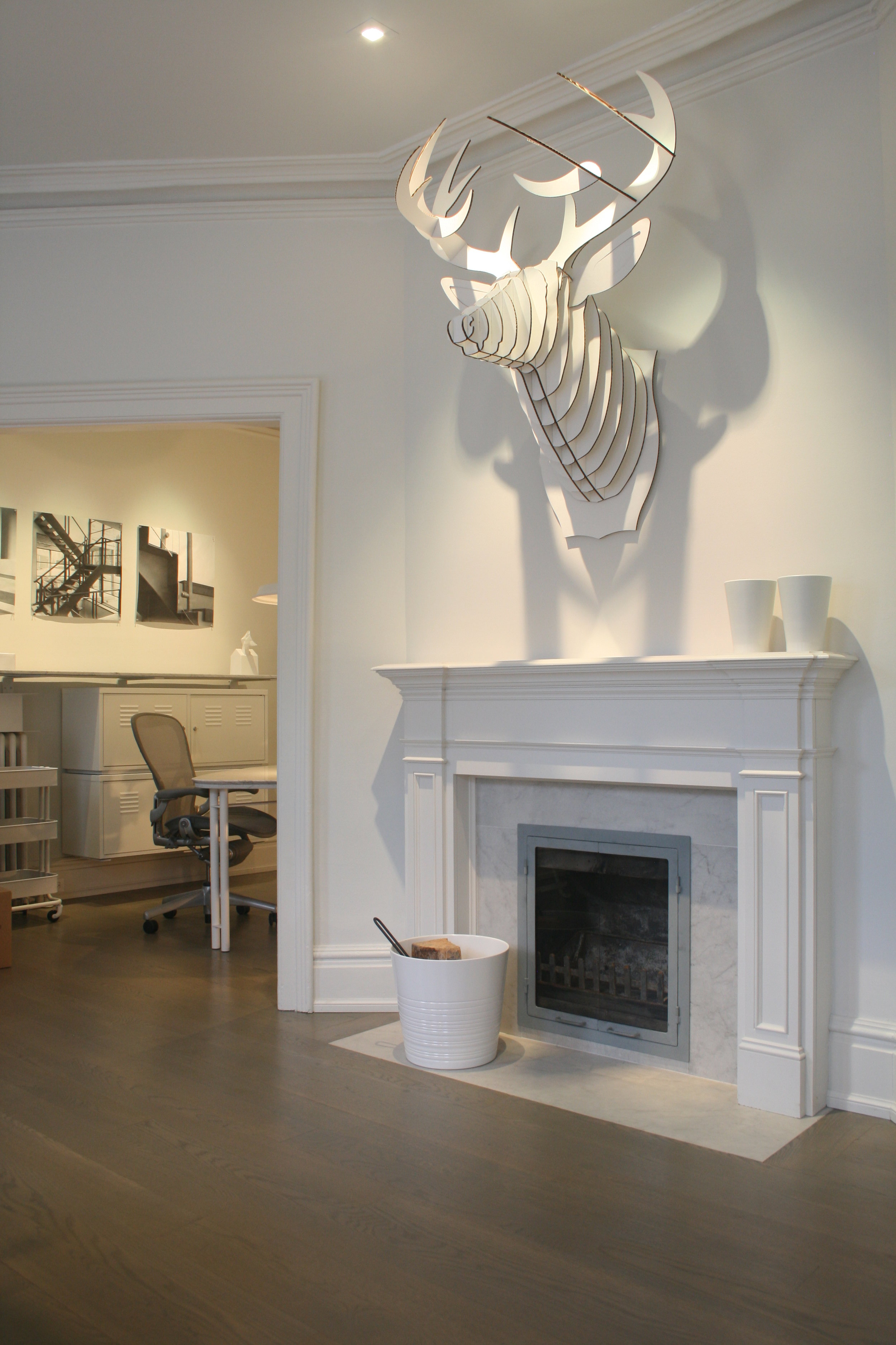
O’Hara and Rayne hired O’Connor not because they ever completely visualized his design, but because they more or less trusted (O’Hara more, Rayne less) that he could translate their nebulous wishes into reality. A hands-on direct personality who knew as a toddler that he wanted to build things (his first drawing was of a construction site), O’Connor runs a design-build company-meaning he came with an experienced crew of stoneworkers, tile setters, carpenters and electricians. When it came to the “old lady”, his main idea was to orient the living room, dining room and kitchen to the north, away from St. Clair. He toyed with four or five plans, all reversing the original layout and turning their back to the street. A wide hall would house O’Hara’s baby grand piano and the dining table. A back porch and sunroom would be enlarged and transformed into a glassy cube of a living room, warmed by ribs of reclaimed Douglas fir. (An advocate of salvaged wood, for its texture and history, O’Connor chose Douglas fir for the structural beams as a nod to Rayne’s West Coast affiliation.)

Accommodating his client’s need for a live work space, O’Connor turned the old living and dining rooms to the right of the entrance door into an office suite. For O’Hara (who craved light more than space), there would be a small office overlooking the street. Rayne (the untidy one, she wanted more space than O’Hara, to hide her surfeit of papers) would get the old dining room, and the two would share and in formal sitting room.

Unlike in the modernized living-dining area, O’Connor set out to “respect the integrity” of the 1923 house in the office suite. Seeing beyond the indigenous frumpiness of the Arts and Crafts style to its sheltering intimacy, he fiddled with the details but kept the envelope. “It’s a house of a certain age in a certain neighbourhood,” he says. “That’s part of the story.” Preserving the dark green-tiled fireplace with its distressed brass outline, he installed another big piece of reclaimed Douglas fir for the mantel and replaced the grandmotherly side cabinets with his own open shelves. The vintage knobs stayed, as did the rounded arch between the sitting room and O’Hara’s office. The windows kept their original shape but were triple-glazed to minimize street noise. Other period details got painted out or simplified, and O’Connor designed a shelf that runs around the suite, unifying it, upgrading the IKEA storage underneath it and making space for family pictures and other mementoes (among them O’Hara’s four Wimbledon competitor’s tags from 1969 to 1972, a souvenir of her youthful tennis career).

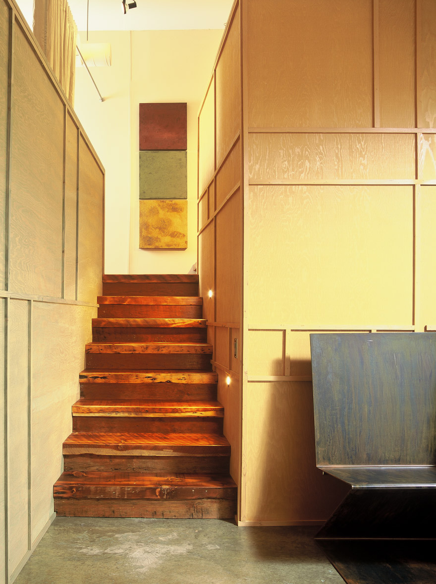
For the attic bedroom, O’Connor wasn’t about to reinvent the wheel. The main floor was more important to his clients, so he contented himself with a few frugal interventions. The result, with its peaked roof and unpainted plywood-panelled walls, is a surpassingly cozy ark for sleeping and watching television. In addition to installing triple-glazed panes up here as well, between the front window and the bed he added further insulation with a novel material: clothing. Camouflaged by a partial wall behind the bed, a casual closet-dressing room, its contents simply hidden by linen curtains, muffles noise and conserves heat.

Remarkable, for two take-charge characters, the women mostly let O’Connor run with his vision. O’Hara says she always knew when the architect didn’t like one of their ideas: “He would take a few steps back while listening respectfully. These steps back invariably meant that it was a no go.” But she demurs when it’s suggested that they were an architect’s dream. “Helen was not the perfect client,” she says, not because she is a goody two-shoes, but because she has to set the record straight. Rayne would wring her hands over the living room’s low ceilings, and O’Hara would urge, “Let’s just give John a chance to finish before you throw in the towel.” Meanwhile both found unexpected therapy in clearing out their basement at Summerhill-“like cleaning your id,” O’Hara reports. The rallying cry for moving house and home was “lighter” -less responsibility, fewer burdens, and death to tchotchkes.

Last April 23, they moved into something that was part home, part construction site and entirely according to John O’Connor’s meticulous master plan. Their bedroom, with its luxurious ensuite bath, was ready, as were the offices and sitting room at the front of the house. But the rest was chaos, hidden behind plastic sheets, a blue tarpaulin and a temporary plywood wall.

The finished areas said good things about O’Connor-his frugality, for one thing, as evidenced in his sagacious ways with the storage cabinets, and Beryll, a $60 IKEA light fixture used in the bedroom and sitting room. (Occasionally bemused by clients in the grip of “pedigree fixation,” he marvels, “Five hundred dollars for the world’s best toilet, yet they’re eager to spend $1,800 for a brand.”)

It was a promising start, but Rayne and O’Hara still didn’t have much sense of what was going on behind the tarp. They feared the hall-dining room was going to look like a large tunnel. “Riley and I were very depressed,” Rayne remembers. The dog wouldn’t eat and wouldn’t go out, moped around her new quarters. Rayne dates her own nadir to a blustery April day when here office was in a shambles and the apartment was as dark as her mood. As she tried to back her car out onto St. Clair, “where I never wanted to live,” she was convinced the move had been a terrible mistake.

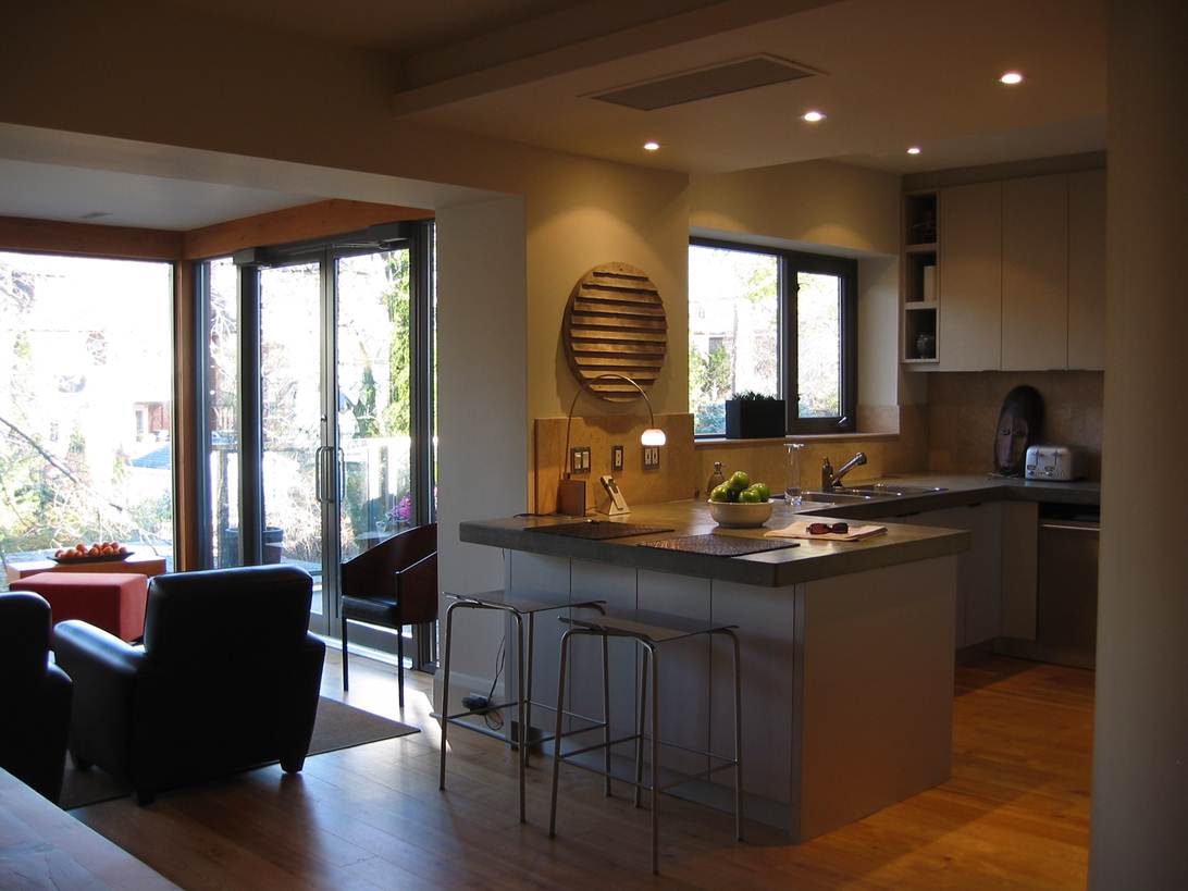
The turning point came two months later, when O’Hara and Rayne returned from a week in Vancouver to see the wide-planked reclaimed black ash floors laid in the hall and living room. Even more dramatic, with the tarp finally removed, was the living room. Rayne thought, “A tree house!” Dominated by windows, it seems to float in space, engulfed by the fingerlike tress of their neighbours’ tree. The room, both arresting and soothing, inspires metaphors. O’Connor thinks of it as a pavilion. Anchoring it is a gleaming white limestone box of a fireplace, which in the early evening, illuminated by two pot lights, strikes O’Hara as a domestic altar. Far from the gloomy tunnel that they feared, the hall-dining room is spacious. The living-room ceiling is distinctly lower than the dining room’s-but that’s only discernible once it’s pointed out. From O’Connor’s bag of tromp l’oeil tricks came a simple, modern archway that separates the two rooms and seemingly raises the lower ceiling.

Rayne and O’Hara’s downsizing had effectively eliminated guest rooms, but they still wanted a shower in the main floor washroom, just in case. O’Connor shoehorned it in by rounding the hall wall, which softens the long rectangle and screens the kitchen with its gentle curve. European style, the egg shaped washroom, entirely lined in apple green tiles and outfitted with a drain, conveniently doubles as the shower when the need arises. The kitchen-a calm meeting of limestone the colour of face powder, stainless steel appliances and a painstakingly trowelled concrete counter- affords its own verdant view of mature gardens and trees, spiked by the occasional blue spruce

Once the wraps were off the north end, everything seemed to fall into place. A born-again devotee of second-floor living O’Hara claims, “Once you think about it, down at ground level is not usually a nice place to be.”

A tour through their aerie demonstrates the benefits of simplification – more like distillation in their case. The extraneous is gone, leaving the things that matter, like the selection of family pictures; flower-choked canvas by the Vancouver painter Jamie Everard in Rayne’s office; and a memento of O’Hara’s Ottawa years, the satirical paintings chez Mulroney by the former prime minister’s embittered chef and household coordinator, Francois Martin, in the sitting room. Other than two midnight brown leather club chairs from Roots that face the living-room fireplace and a long, chunky dining table designed by O’Connor, there are relatively few new possessions. And each one is warmly debated by the potential owners, as are a few unresolved issues. Rayne for example wants to put a whitewash on the plywood walls in their bedroom; O’Connor and O’Hara don’t. Every time Rayne gets a visitor to agree with her, there’s a loud crow from the bedroom.

The work came in on time and within the $200,000 budget. The unexpected expenses were almost always the clients’ doing, as on the famous day when Rayne insisted on a brushed stainless steel faucet, at $300 more that the shiny one that O’Connor had installed. The “skinflint” architect jumped in the truck and tore off to procure the new hardware. “Clients focus on the details,” he says indulgently.

O’Hara, a freelance writer wishes that her office were a tad bigger. And her chic concrete counter (she is the family cook) is turning out to be more maintenance that she bargained for. “Just use it and call the stains patina,” O’Connor tells her, but she points out a dingy sidewalk and says, “See that? That’s the future of my concrete counter.”

Rayne admits to a certain nostalgia for the Summerhill garden: “I miss Jane and Riley sitting out on the back stoop in the evening, looking at the garden together.” But O’Hara, who tends the handkerchief-sized plot on St. Clair, says she loves the attention she gets from passers-by.

Beyond those details, the two women are superbly content. Not only happy, they seem genuinely surprised that an impulse move verging at times on the tentative has resulted in quarters both stylish and unconventionally tailored to their wants. Rayne, the doubting Thomas, feels she’s the daily beneficiary of John O’Connor’s passion for materials and attention to detail. O’Hara, the St. Clair booster from the start, adds: “No way I ever dreamed it would be this nice.”