Dave LeBlanc
GLOBE AND MAIL - FEBRUARY 20, 2019
Setting up a condo sales office is one thing; the target market has already been determined, and the appropriate design follows. The office for a design-build firm is a bird of a different feather, however; one has to show their prowess, but not come on too strong since, after all, one never knows who might walk through the door.
“The theme I had was ‘Cuban infirmary, 1947,’” says architect John O’Connor, followed by a huge laugh that fills the front room of Cabbagetown’s 203 Carlton St.
He’s only half joking.
After an exhaustive search for an HQ for his 20-year-old business, Basis Design Build — “I was looking for a warehouse in the back alleyway kind of thing, I wanted to walk to work” — the Cabbagetown resident noticed an old Victorian home for sale near Ontario St. two years ago. Not only was it a good deal, he liked the heritage-protected building’s quirkiness: the too-fat, two-storey bay window, accompanying shutters and, inside, the stacked octagon-shaped rooms, original moulding and stairway niche.
“I thought, instead of a warehouse, it’s got a lot more personality,” says the Waterloo graduate who once worked for Vancouver legend Arthur Erickson.
Because it had been occupied by a graphic designer for decades, the former home of lawyer William Foss — he built and occupied the home in 1883 — wasn’t a mess. But it did require a somewhat anonymous identity so potential clients could envision their own spaces rather than Mr. O’Connor’s, which is where the infirmary idea came in.
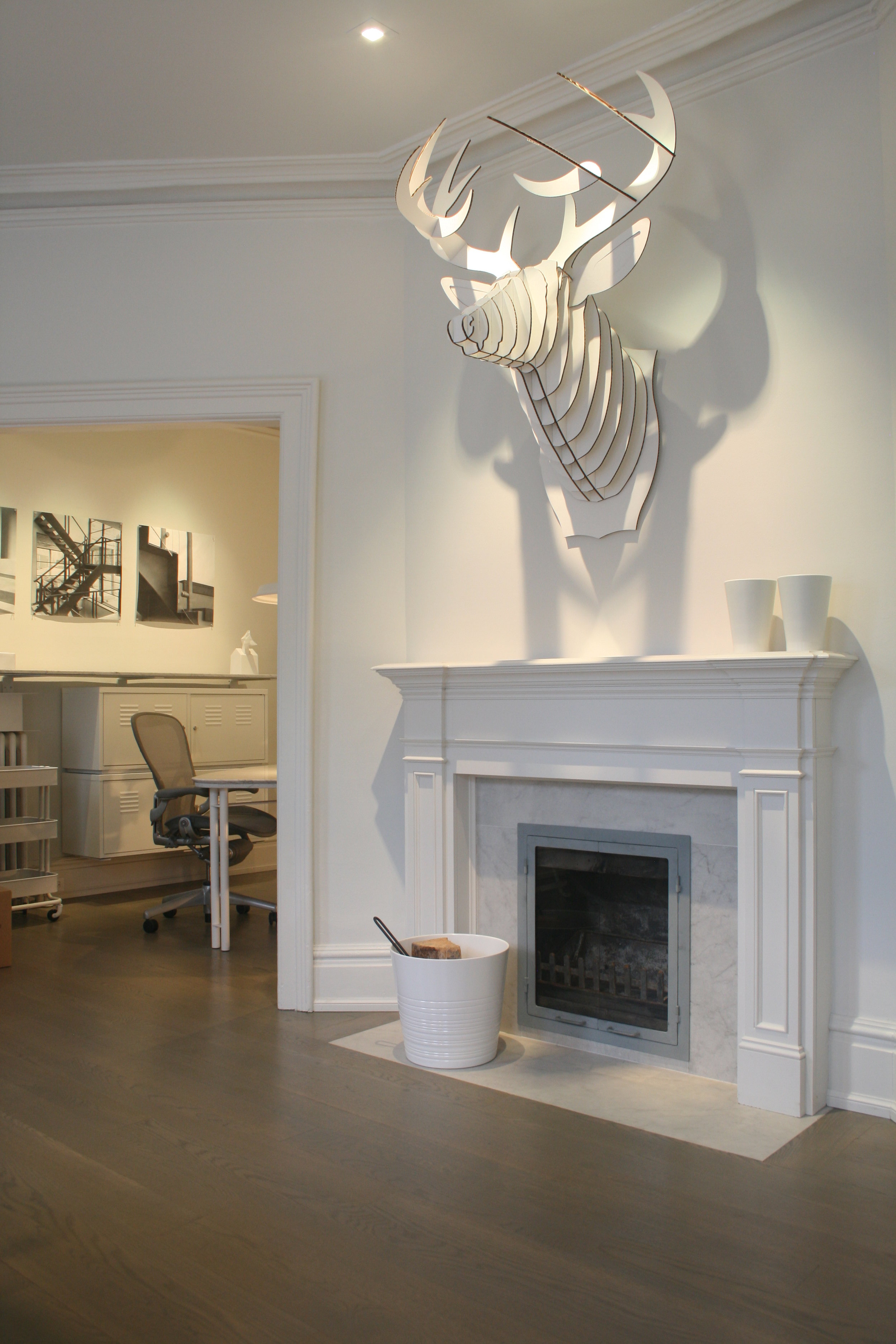
Infirmaries, by their nature, must be clean and neutral; too many jazzy colours or jarring, ornate décor and healing is no longer the focus. So, in the public rooms of Basis, one’s eye has trouble falling on any one particular object, since all are white: white-painted metal pendant lighting, white chairs, a white fireplace surround … you get the idea.
But look closer and the unusual begins to appear: a vintage stenographer’s table, painted white; vaguely medical-looking IKEA cabinetry; exposed conduits; and old lath pressing against white plaster walls provides texture. And because Mr. O’Connor can’t help himself, bits of his fun-loving personality rear their silly heads in the form of a hard-hatted Elvis bust dominating the stairway niche (where a religious figure once stood), and the “cardboard safari” of a mounted deer buck over the fireplace.
The overall effect is a comfortable, welcoming space where the overtaxed mind relaxes to allow ideas to blossom. In a way, a visit to Mr. O’Connors’ office isn’t all that different than checking into the Cuban infirmary’s close cousin, the Soviet sanatoriums of the 1930s-80s. A strange hybrid of medical facility and spa, visits to these soothing spaces were mandated (and paid for) by the Kremlin, and were filled with sunlight, non-porous tile, oil- and mud-baths and therapeutic swimming pools.
Okay, that might be stretching it.
But, if therapeutic bocce ball is your thing, Mr. O’Connor has a court in his backyard and, if you ask nicely, he’ll take you past hard-hatted-Elvis to the upstairs work area, where a refreshing display of creativity is on display. Past the big plotter (which sits in an odd, Munchkin-sized greenhouse area where windows reach the knees), a long room with a sloped ceiling contains a controlled frenzy of architectural activity. Here, pinned-up sketches on onion-skin paper compete with framed photographs of snazzy finished work, laptops sit on IKEA-hacked desks that look more expensive than they should, product samples hold down architectural drawings, Umbra stools made of twisted rope provide texture and, overhead, Mr. O’Connor’s hand-built 1990s chandeliers, made from cheapo colanders, ginger graters and other shiny bits-and-bobs, illuminate the scene while adding a touch of whimsy.
“We made this space to be creative in and not worry about writing on the walls or hanging stuff up,” he confirms. That loosey-goosey aesthetic is allowed in other second floor rooms, too: In a little boardroom not far away, sketches are pinned directly onto the large, drum-shaped lampshades.
Regimentation, if there is any, is found in the building’s white oak flooring. The less busy, whiter pieces, explains Mr. O’Connor, were saved for the public rooms: “This’ll sound like I’m completely insane, but we searched around for these floors … then we sorted all the wood so the front rooms would be better, and [the back rooms would contain] all the wavy, unmatched [stuff] in grey and black.
“No one knows that except for me now,” he laughs, then looks down at the floor. “It was important at the time.”
While bouncing from room to room, the conversation bounces between Mr. O’Connor’s short-lived career as a house-flipper (it lasted for one house), to European cities he’s studied and worked in (many), to doorknobs (most are white porcelain and ordered from Ohio) and, finally, to how he deals with financial stuff at Basis.
“We’ll start talking about money on the first day,” he begins. “I know way too many cases where people have worked with an architect for a year, and then they’ll go thru the Committee of Adjustment and they get the price from the contractor and it’s double or triple of what they want to spend; so you’ve not only wasted a year, you’ve wasted the dreams and aspirations and everything.”
That would be a shame, since, here in these white, uncluttered rooms, dreams of house and home flow from head to pen rather quickly.

